Category Archives: Writing research reports

How to create tables from data

What is a table?
Tables present the results of data or information collected from a study. The purpose of a table is to present data summaries to help the reader to understand what was found. Not all data needs to go into a table: some results are simply presented as written text in the results section; data that shows a trend or a pattern in between variables is presented in figures, while additional data not necessary to explain the study should go into the appendix.

Tables should convey data or information clearly and concisely and allow the key message to be interpreted at a glance. Tables often include detailed data in rows and columns, while sub-columns are often nested within larger columns.

Designing your table
Once you have decided what data to present, jot down a rough draft of the table headings on paper to determine how many columns and rows you need. Choose categories with accurate labels that match your methodology and analysis. Before you spend too much time designing the layout of your table, check that you are following the format expected within your discipline or organisation as table formatting requirements often vary considerably; if you are preparing a science report, refer to the relevant In-House Style Guide(s) or if you are preparing a journal article, meticulously follow the journal’s Instruction to Authors.

Title or Legend
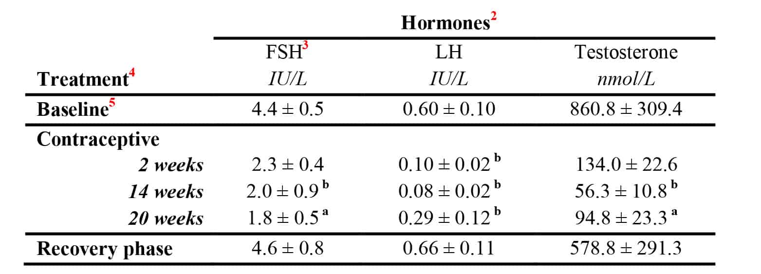
Consider the objective and key message of each table. The table title is typically placed at the top of the table. It should stand alone: it needs to be clearly understood by your target audience without them needing to go back to the results or methods sections. The title should be concise and describe what was measured, e.g. ‘Reproductive hormone levels during contraceptive administration in men’. Frame the title so that it conveys the key results, e.g. ‘Reproductive hormones are suppressed during contraceptive administration in men’.

Sub-headings
Take care to ensure the sub-headings are meaningful and accurate. The row and column headings clearly explain the treatment or data type, and include units. In the sample table below, the experimental details are given in the row headings (time points during the administration of a contraceptive), and the data measured (hormones) are given in the column headings. 

Example Table

          In this example table, horizontal lines have been used sparingly to improve clarity.

Explanatory notes
Explanatory notes and footnotes are placed at the end of the table. Make sure that all abbreviations are defined and that the values are explained. For example, if the values are a percentage, mean ± SEM, n per group.

Drawing and formatting the table
Tables for publication can be created in Word, using the 'Insert Table' function. For instructions see: Office Support: Insert or create a table.

- Tables can also be created from existing datasets in Excel, and then cut and pasted into Word, or exported into Word as an image.

- Use a separate cell for each piece of information; avoid having to insert tabs or spaces which may cause the text to be unintentionally moved when the formatting is adjusted.

- Add your headings and data to each cell. Cells can be merged to create headings above sub-headings. Select the cells you want to merge then select the 'Merge Cells' option.

- The table then needs to be formatted to improve readability and clarity. Select the entire table or individual rows or columns and right click. Options will appear where you can modify the table size, cell height and width, and format the borders. Word tables will have borders on each side of the cell by default.

- Format the borders by selecting columns, rows or individual cells will help the table to take shape and improve visual clarity.  Text within the table can be formatted by selecting the text, then formatting it as normal.

- Make sure that the columns and rows are well separated and that the table is not cluttered and is easy to read. Imagine the reader looking at your table: do they have access to all of the information they need and can they easily understand the results?

Formatting borders helps a table to take shape and improve clarity. Select and de-select the horizontal and vertical lines you want to use as borders

Citing the table

Always cite the table at the relevant point in your text. Avoid repeating the details that are presented in the table, and use the text to direct the reader to the main message, e.g. ‘Contraceptive administration at 14 and 20 weeks significantly suppressed FSH, LH and testosterone levels in men (Table 1)’. Tables should be numbered consecutively throughout the document.

Further reading: (external links)

* Creating tables in scientific papers: basic formatting and titles
* How to create and customize tables in Microsoft Word
* Tips on effective use of tables and figures in research papers
* Tables and Figures
* Office Support: Insert or create a table

© Dr Liza O’Donnell & Dr Marina Hurley 2019 www.writingclearscience.com.au

Any suggestions or comments please email info@writingclearscience.com.au 

Find out more about our new online course...


SUBSCRIBE to the Writing Clear Science Newsletter

to keep informed about our latest blogs, webinars and writing courses.

How to create figures from data

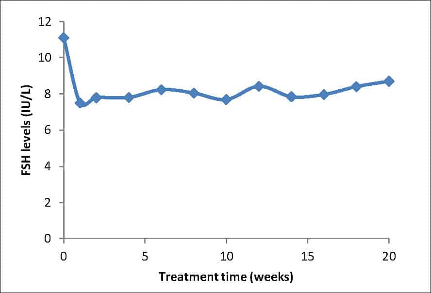
Figure 1: A line graph conveying a simple relationship between two variables. In this case, the variation of a measured hormone  over time.

 What is a figure?

Figures visually present information that cannot be clearly explained as written text or presented in a table. Figures can include graphs, flow charts, photographs, maps, illustrations, micrographs and diagrams. They can be simple; for example, a one-line graph that conveys a simple relationship between an x and y variable (see Figure 1), or they can contain multiple components, such as a graph, a diagram, a micrograph or photograph (see Figure 2). Figures have labelled components and a figure legend that clearly describes these components and summarises the key features.

 Planning your figure

As with tables, figures help the reader understand what you have found:  for example, key observations, statistically significant results, expected or unexpected trends in the data or any matter that needs further explanation. Figure design occurs after the data has been analysed and the main findings are apparent. The figures are usually presented in a results section and discussed in relation to  your research question or problem statement that was raised in your introduction. What figures you present also depends upon whether you are writing a report, journal article or thesis. A report can have a multitude of figures, while journal articles usually have strict page limits that force firm decisions on the number that can be included. Usually, there is more leeway for additional figures in a thesis.

Figure 2: An assembled figure contains multiple panels

When deciding how to place figures, prepare a mock layout to work out where each component will go, either by drawing boxes on  paper or by printing draft versions of what you expect the final version to look like. Will the figure take up one column or will it be a large multi-panelled figure that takes up two columns of a journal or one entire page of a thesis? (Figure 3)


 Preparing figures for journal publication

If you are preparing figures for journal publication, it is essential to first check the publisher’s requirements. Most journals have strict and detailed instructions with specific criteria: for example, image size, file type, resolution, colour space (e.g. RGB) and font types. If these criteria are not followed exactly, your publication may be returned by the editor for further changes.

Turning your raw data into a published figure: stay true to your data

Scientists are ethically bound to present their data truthfully and transparently. As a scientist, it is your responsibility to ensure that your figures accurately convey your original data and observations. In addition, universities and research centres must comply with the Australian Code for the Responsible Conduct of Research. As you manipulate your raw data into graphs and prepare your images for publication, your raw data is inevitably transformed in some way; even simple line graphs are a transformation of a set of experimental values. Photo-editing programs can also transform digital images by re-sampling (see fact sheet: Preparation of figures as digital images), which could result in an image that is different to the original.

Figure 3: Consider whether your figures are small enough to fit in one column to save space; larger figures may require two columns.

When preparing figures for publication in any form, it is important that you adhere to your organisation’s requirements for transparency and peer review. How you manipulated your raw data into the published figure  must be  transparent and repeatable. For example, does your final, published image look like the fluorescently-labelled image you saw down the microscope? Is the photo one actually taken of your study subject and not  another one similar to yours? Does your graph accurately explain the data, or have you left out some aspects of the data and inadvertently misrepresented your original findings? Make sure you save your files at each step of the transformation from raw data into a final published figure, and keep the files together in one folder.

What software do I use?

First, establish what software is freely available to you via your university or organisation.  Graphs and charts can be drawn in Excel and in a variety of statistical programs. CorelDraw or Adobe Photoshop and Illustrator are often recommended by publishers to draw diagrams, and to compile your images, graphs and diagrams into a publication-quality figure.

If looking to use free software, open-source software is often a good choice as it is completely free and is supported by an online community that engages in ongoing support and development. For example, freemind software for mind-mapping and Gimp for photo and image manipulation, and see Wikipedia for software listing for graphic software.

Microsoft Powerpoint is often readily accessible and can be useful for drawing or compiling diagrams. Set the page layout to A4 portrait and add all components, using alignment tools and rulers to align panels and text. However, Powerpoint only exports lower resolution files for monitors, rather than higher resolution required for printing. A way around this is to print the Powerpoint file to a pdf (using Adobe Acrobat Professional) and select High-Quality Print (300 dpi) in “Preferences”. The resulting pdf file can then be cropped and saved as a TIF file with a 300dpi resolution (use either Adobe Acrobat or Photoshop to crop and save as a TIF).

The essentials of a good figure

Once you have created the figure, check the following criteria:
- Does it look good when printed on paper? Can all the features of each different components be clearly seen?
- Are the labels clear and specific?
- Is the resolution of the final assembled figure appropriate?
- Does the legend title convey the key finding?
- Do the details in the legend adequately explain all of the components?
- Is the figure referred to at the appropriate places in the results section? Does the figure accurately convey what is written in the results?
- Ask a colleague to proofread and check the clarity of your figure. Can they understand the overall message? Do they understand what the different components are?

© Dr Liza O'Donnell & Dr Marina Hurley 

Any suggestions or comments please email admin@writingclearscience.com.au 

Find out more about our new online course...


SUBSCRIBE to the Writing Clear Science Newsletter

to keep informed about our latest blogs, webinars and writing courses.